In the crowded landscape of corporate mascots, few achieve a status that transcends their original purpose. The Michelin Man, whose birth name is Bibendum, is one such figure. Moving past his 125-year history, his continued relevance offers a neutral, clear-eyed case study in effective, adaptive brand identity. He is not merely a relic of advertising past but a strategically maintained asset that performs several critical functions for the Michelin brand today.
From Literal Symbol to Abstract Trustmark
Initially, his form was a direct, physical argument: a man made of tires symbolized durability, strength, and the product itself. Today, that literal interpretation has evolved. Few consumers consciously see a stack of tires. Instead, they recognize an icon of quality, reliability, and a certain jovial expertise. This shift from product-literal to value-abstract is key to his longevity. He no longer sells a tire; he embodies the trust and reassurance Michelin wants associated with all its offerings, from restaurant guides to digital mobility services.
A Neutral Pillar in a Multi-Faceted Brand
Michelin operates in two distinct arenas: high-stakes industrial B2B (tire manufacturing) and influential B2C (dining guides, travel). The Michelin Man serves as a neutral, unifying bridge between these worlds.
-
In B2B: He represents heritage, engineering excellence, and corporate stability.
-
In B2C: He is the friendly, recognizable face of the famed Michelin Guide and travel resources, adding approachability to a brand synonymous with elite judgment.
This duality is a strategic strength. He provides consistent visual identity while allowing separate campaigns to tailor their messaging around him—from technical, safety-focused ads to playful social media posts about culinary adventures.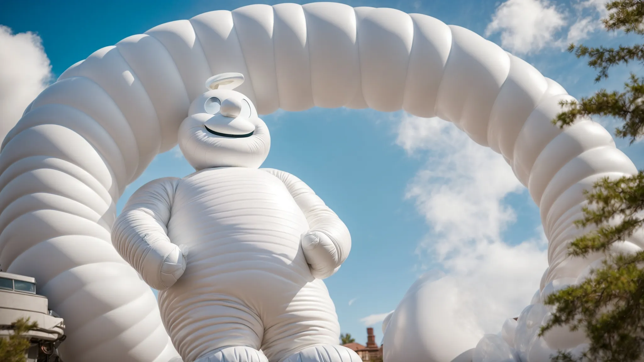
Adaptation Without Loss of Core Identity
Neutral analysis must acknowledge that mascots often fail when they become stagnant or undergo drastic reinvention. Bibendum has avoided both. His design has streamlined—shedding glasses, cigars, and reducing his tire count—moving from a detailed gentleman to a cleaner, more versatile graphic form. These changes were subtle, evolutionary adjustments to design trends, not revolutionary rebrands. The core silhouette—the rounded, pillowy form—remains instantly identifiable, a testament to the strength of the original design principle.
The Cultural Handshake
The Michelin Man’s true modern power lies in his role as a cultural handshake. He is a pre-approved symbol of goodwill that the brand can deploy in diverse contexts. Appearing in parades, as collectible figurines, in charitable campaigns, or as meme-worthy social media content, he performs “brand diplomacy.” This maintains top-of-mind awareness not through aggressive salesmanship, but through positive, low-stakes cultural presence. It keeps the brand human in an increasingly digital marketplace.
Conclusion: More Than a Mascot, a Metric
Objectively, the Michelin Man’s sustained prominence is less about nostalgia and more about continuous utility. He functions as:
-
A Visual Shortcut for brand values (quality, trust).
-
A Unifying Asset across diverse business divisions.
-
A Flexible Ambassador for global cultural engagement.
In essence, he has graduated from a mascot to a managed equity. His value is carefully stewarded by Michelin’s brand managers, who understand that while products and campaigns evolve, this singular, neutral icon provides a rare constant: immediate, friendly, and trustworthy recognition in a world of fleeting consumer attention. His “pretty good” ranking isn’t an accident; it’s the result of over a century of deliberate, nuanced brand stewardship.